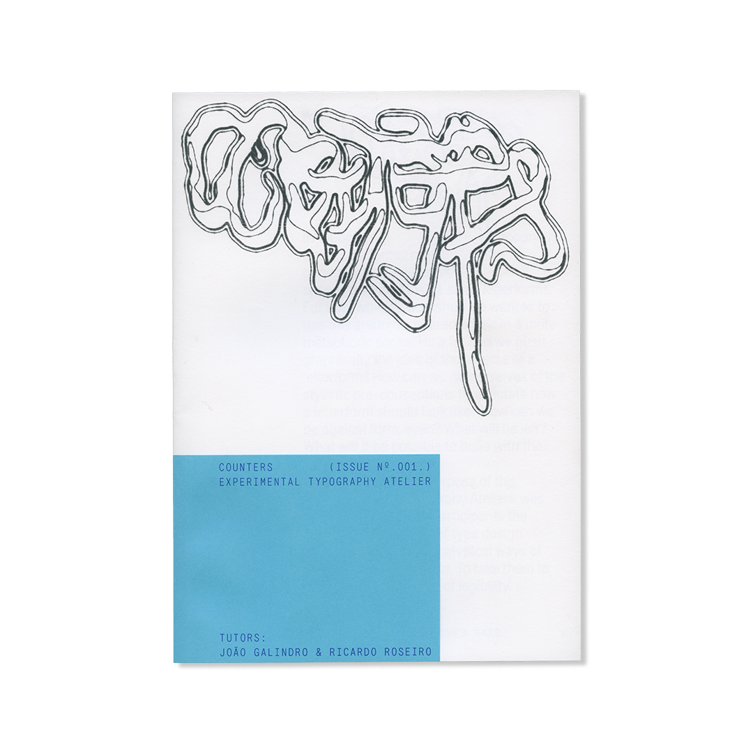
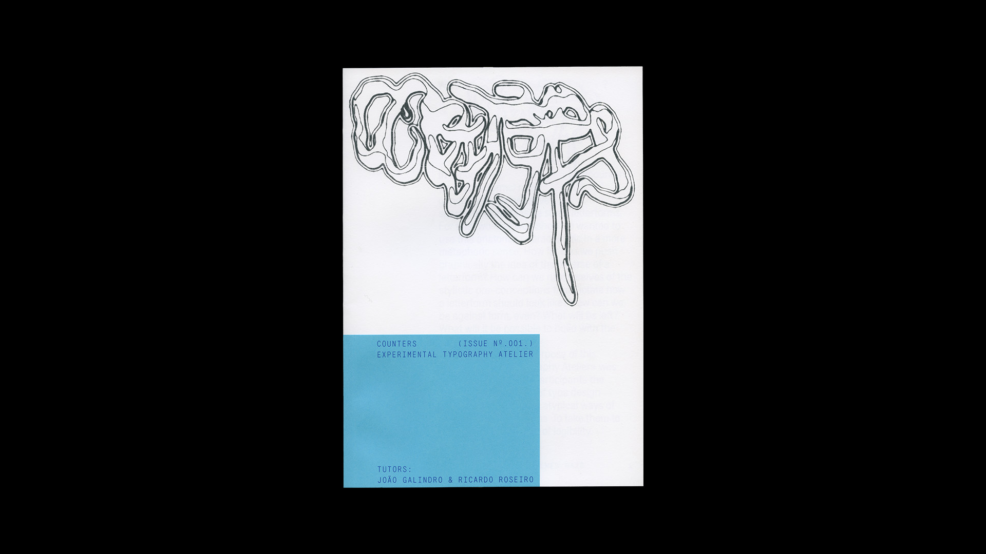
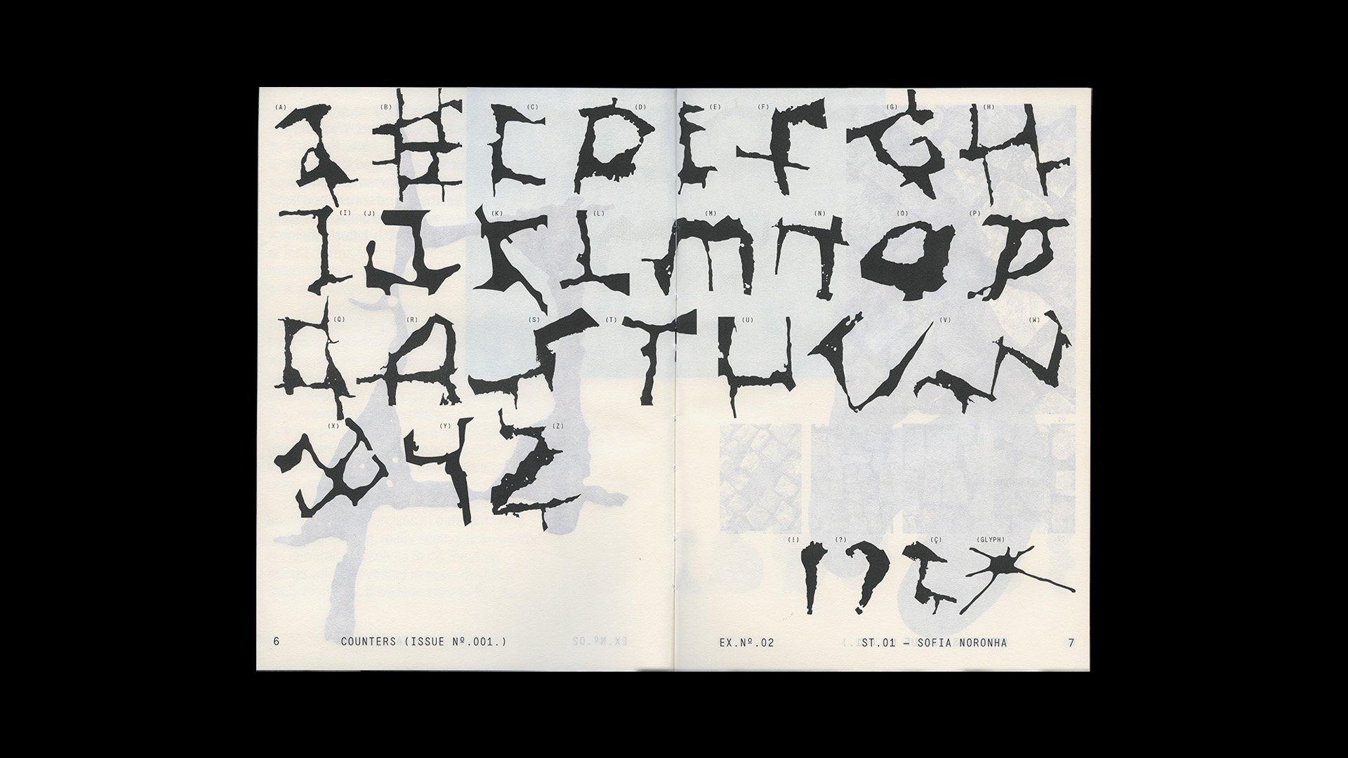
In Typography, (counters / or counterforms) refer generally to the negative spaces enclosed inside some letterforms. For this two-day workshop we wanted to use this anatomic characteristic in a more metaphoric sense: How far can we push graphically the idea of the reverse of a letterform? How can we rid ourselves of the stylistic pre-conceptions that dictate how a letterform should look like? How can we be against form, even? What will be left? What will it be possible to build with the scraps that remain?
In this way, the purpose of this «Experimental Typography Atelier» was not to share with the participants the conventional process of type design but, instead, to explore atypical ways of representing letterforms. To take them to the absolute threshold of legibility.
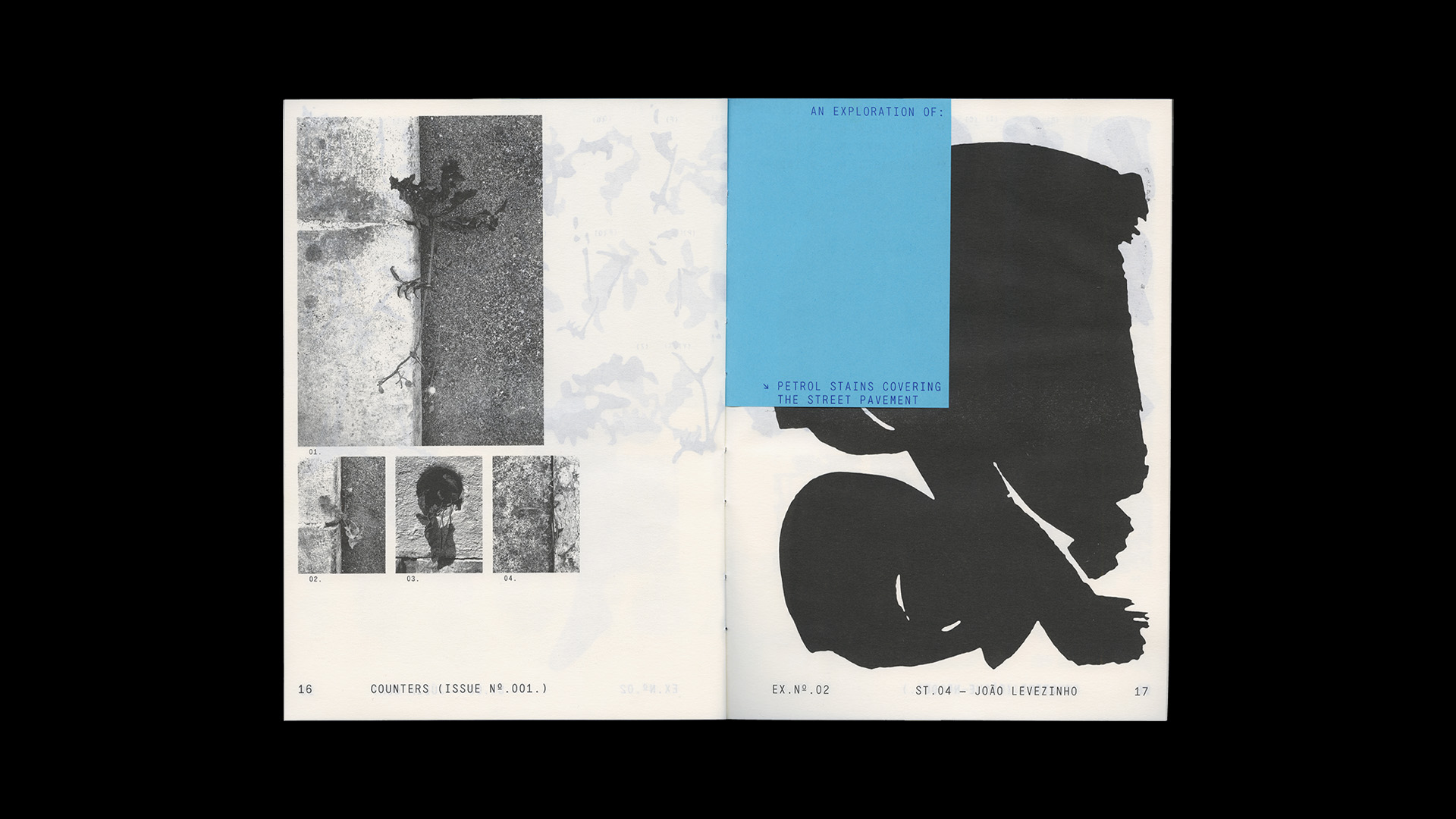
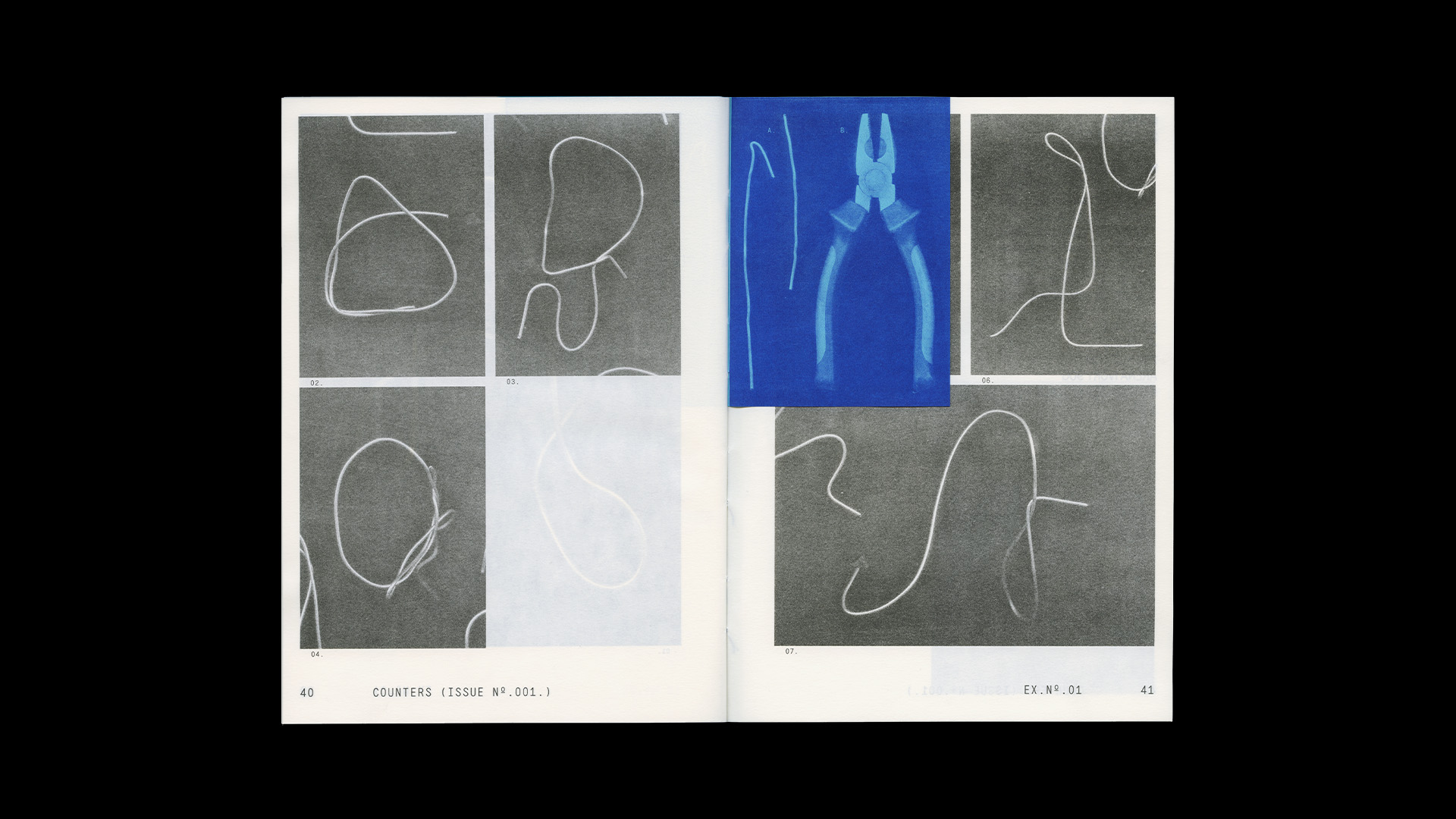
As we walked towards this path of abstraction, we encouraged participants to find captivating shapes in the city that demanded to be looked at twice, three times, or more even, until they could finally be decoded. This is, we believe, the greatest potential of this approach. We wanted to subvert the utilitarian function of letterforms, which is to communicate information in the clearest, most accessible and immediate way possible. We wanted the opposite. We wanted for the readers that pick up this publication to spend more time with these images than we are told we are supposed to today, in an era where everything is consumed and discarded at an unsustainable pace. So, to the pleasure of making things slowly, we add the pleasure of looking with a gentle gaze. Disruptive typography has this speculative potential: it makes us work and consume calmly.
The following formal exercises were, above all else, exercises in different ways of seeing. Seeing, really seeing, is an ability we can train ourselves to do. Exciting things will be revealed in even the least likely of places, if we lean how to focus.
The more we practice this renewed look, the more we will be able to see. We invite you, as we did with our students, to look anew to things that are judged straight away as uninteresting, broken or repulsive, and see their aesthetic and conceptual potential. These, with a little empathy, can turn into anything you wish, letterforms or otherwise.

